Acknowledgment
This US County health analysis is dedicated to individuals who are the victims of the Covid-19 virus and to all the people working hard to keep our US Counties safe, healthy and nourished.
St. Paul, MN native Marion Goldetsky Klein was devoted to her family, her community and her Jewish faith. “She didn’t know the meaning of the word ‘no.’ If you asked her to do something, she did it. She was active in every Jewish women’s organization possible, not just as a member, but she was a leader.” Klein died after contracting COVID-19 in the Memory Care Unit of Sholom Home West in St. Louis Park. She was 87. Star Tribune
This analysis relates County diabetes incidence to covid-19 deaths across 3,142 US Counties. Are Counties with populations most affected by diabetes also Counties with high covid-19 death rates?
County health statistics report on public health. The information supports community investment decisions made by local, County, and Federal administrators to improve County health services and public health.
Summary — Data as of May 14, 2020
In summary, public health and health services in some large Counties and many small, rural Counties with high diabetes incidence are also combating relatively high covid-19 death rates. Mid-size Counties, with between 250,000 and 1 million residents, have a large share of covid-19 deaths but the death rates from covid-19 in those with or without above average diabetes incidence are about the same — mid-size Counties with large Hispanic American populations has an effect on these results.
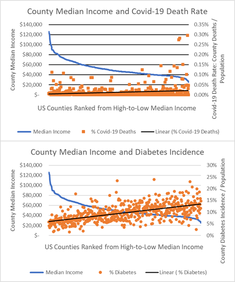
Perhaps unsurprisingly, Counties with high median incomes are associated with slightly lower covid-19 death rates than Counties with low median incomes. This is indicated by the upward tilt of the black linear trend line in the first chart below (highest income Counties on the left but the highest covid-19 death rates are to the right). A “negative” association is also found between County median income and County diabetes incidence, but it is stronger.
Covid-19 Deaths v. Diabetes: US Counties Ranked by Median Income
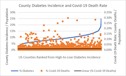
How strong is the association between County diabetes incidence and County covid-19 death rates? In fact, there is no overall association between County diabetes incidence and County covid-19 death rates. This is illustrated by the “flat” black linear trend line in the chart below. But, groups of Counties do differ, of course, and, as indicated above, this analysis illustrates those where diabetes incidence and covid-19 deaths are related.
Covid-19 Deaths v. Diabetes: US Counties Ranked by Low-to-High Diabetes Incidence
Prosperity is more complex than just consumption. The covid-19 crisis has proven that a healthy and safe workforce is required to sustain consumer societies. It is likely we’ll be better off if US economists begin to measure our markets and shareholders value our corporations in ways that will account for not just the goods and services they create, but also the value they contribute to sustaining community health outcomes.
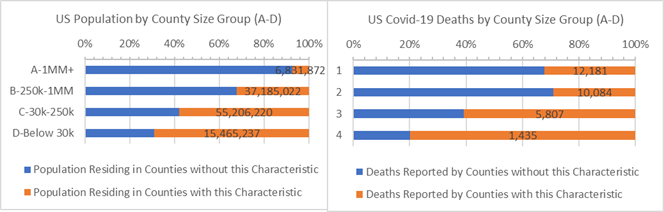
Analysis of Covid-19 Deaths
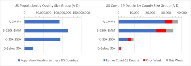
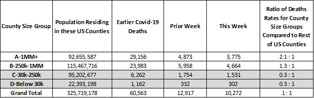
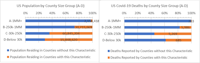
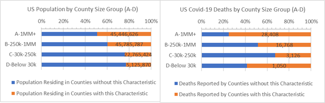
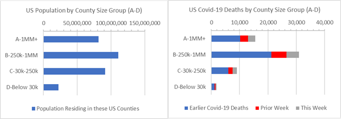
Many of these trends relate to County public health and County health resources. The pandemic has fallen heavily on 6 NY state Counties that were ill-prepared for it. It especially affected the 44 largest US metropolitan “A” Counties with 1 million residents or more. Nationwide “A” Counties account for 28% of the US population and 45% of covid-19 deaths. The table below shows that covid-19 death rates in “A” Counties are 210% higher than in the rest of the US (the calculation of death rate ratios, such as 2.1 : 1, is explained in the Analysis Approach section at end of this analysis).
US Population and Covid-19 Deaths by County Size Group
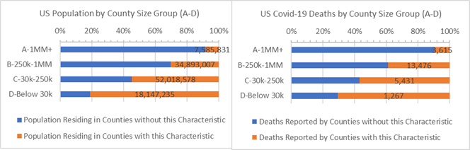
Excluding New York state brings “A” County death rates back in balance – a 1 : 1 covid-19 death rate ratio compared to the rest of the US. Covie-19 death rates in 250,000 to 1 million resident “B” Counties are also very high. Their vulnerability is more pronounced when New York state is excluded.
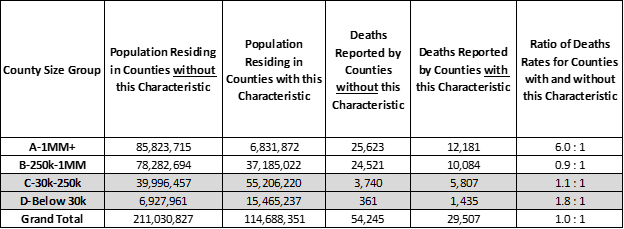
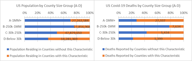
Relating covid-19 death rates to US Counties with above an average diabetes incidence, which affects 8% of the US population, helps understand the imbalances. The chart below highlights Counties with above average diabetes incidence (orange bars).
Taken as a whole above average diabetes incidence Counties represent 35% of the US population. As indicated above, overall, their covid-19 death rates are the same as the rest of the US though they account for 46% of US diabetes cases. But the even 1 : 1 death rate ratio for the US overall masks differences behind large and small Counties with high diabetes incidence.
Only a small fraction of urban “A” Counties with populations over 1 million have above average diabetes incidence rates. However, this 2% slice of the US population (or 6.8 million) reports 15% (or 12,000) of all US covid-19 deaths. Residents in “A” Counties with above average diabetes incidence have 500% higher covid-19 death rates (6 : 1 ratio) than the remaining “A” Counties. Death rates are 360% higher (4.6 : 1 ratio) than other “A” Counties when New York state is excluded. A few “A” Counties have large diabetes and covid-19 public health problems and are listed below.
“B” Counties with 250,000 to 1 million residents have the highest number of covid-19 deaths; however, covid-19 death rates are slightly higher in “B” Counties with below average diabetes incidence (blue bars). “B” Counties that keep the incidence of diabetes low have succeeded holding off high covid-19 death rates.
71.7 million Americans reside in rural “C” and “D” Counties with populations under 250,000. In “C” Counties, with between 30,000 and 250,000 residents, covid death rates are 10% higher (1.1 : 1 ratio) in Counties with above average diabetes incidence than the remaining “C” Counties. In “D” Counties with less than 30,000 residents, they are 80% higher (1.8 : 1 ratio) in Counties with above average diabetes incidence.
In some large “A” Counties and smaller “C” and “D” Counties where diabetes incidence is above average, public health and health services struggling with diabetes are also struggling with relatively high covid-19 death rates. While most covid-19 deaths are in “B” Counties, the death rates are lower in the B Counties with above average diabetes incidence.
Counties where Diabetes Incidence are 8% or more of the population (orange)
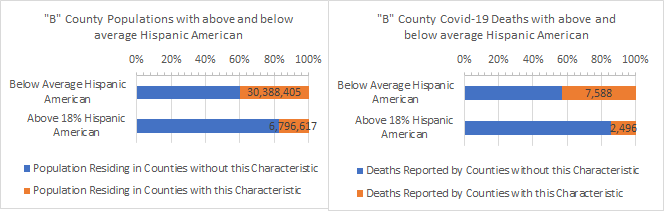
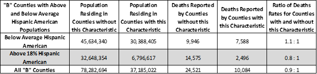
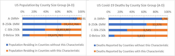
The largest share of covid-19 deaths among “B” Counties falls on those with above 18% Hispanic American populations — they have 90% higher covid-19 death rates than the remaining “B” Counties (see previous article in this series). But among them the share of deaths is largest in those with below average diabetes incidence. Above average Hispanic American Counties with below average diabetes incidence have the highest “B” County covid-19 death rates. Above average Hispanic American “B” Counties with above average diabetes incidence have 20% lower covid-19 death rates. As the table indicates “B” Counties with smaller, below average Hispanic American populations and above average diabetes incidence report 10% higher covid-19 death rates (1.1 : 1 ratio) when compared to the remaining below average Hispanic American “B” Counties.
“B” Counties where Diabetes Incidence are 8% or more of the population — with above and below average Hispanic American populations
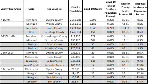
Current covid-19 deaths and death rates for the highest diabetes incidence counties in each urban-rural County size group are listed below. As a reference, the overall US covid-19 death rate is currently 0.03%. All of these Counties have above 8.0% incidence of diabetes.
Top Counties where Diabetes Incidence are 8% or more of the population by County Size
Many American Counties have alarming covid-19 death rates, and many have alarming diabetes incidence. Counties require community investment in parks, nutrition services, hospitals, health clinics, and, very soon, contact tracing, if the US wants all County resident to prosper. Resources are required so those that are under-served can take ownership of and sustain their future.
Analysis Approach
This is one of a series of analyses that relate covid-19 deaths to key County health and demographic characteristics, such as cancer death rate or percent of adults over 60. In each, side-by-side bar charts illustrate how Counties are faring in the covid-19 crises when grouped by size of population and median income and split by those above and below the characteristic’s average.
Each analysis focuses on Counties where the health or demographic characteristic is higher than some “average”. The “average” is defined here as the characteristic’s incidence or percentage — think of average cancer death rates or percentage of adults over 60 — that accounts for roughly 1/3rd of the US population when the Counties that qualify are pooled together. Covid-19 deaths are then totaled for Counties that come in above or below the “average”.
Side-by-side bar charts illustrate how Counties are faring in the covid-19 crises when grouped by size of population and median income and split by those above and below the characteristic’s “average”.
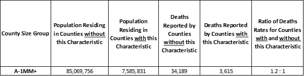
The numbers also tell a story as 1/3 versus 2/3 population comparison is written as an population ratio of 1 : 2, which is the same as 0.5 : 1 since we want 1 to represent the basis of comparison. Of course, these “odds” ratios change as the data and the populations change. Take, for example, the ratio that helps us compare the covid-19 death rates for Counties with above average percent adults over age 60 to those with below average percent adults over 60. All things being equal, the ratio of covid-19 death rates should match the ratio of the County populations. Typically it won’t: “For Counties with 1 million or more residents, the covid-19 death rate ratio of those with above average percent adults over age 60 to that of the remaining Counties with 1 million or more residents is 1.2 : 1. In other words, residents living in Counties with above average percent adults age over 60 have a 20% higher chance of a covid-19 death than residents living in the remaining Counties that have 1 million+ population.”
Here’s an example. First, the covid-19 death rate is computed by the covid-19 deaths divided by population. For the entire US, as of today, the covid-19 death rate is 0.03% = 83,752 / 325,719,178 meaning 3 out of 10,000 residents have died. Next, we create the covid-19 death rate ratio by comparing the death rates of the Counties with and without the characteristic. In this example, the 1.2 : 1 ratio means residents in “A” Counties with above average percent adults age over 60 have a 20% higher chance to die from covid-19 than residents of Counties without the characteristic. The ratio is calculated here as: 1.2 = (3,615 /7,585,831) / (34,189/ 85,069,756). The 1.2 represents the numerator, or counties with the characteristic, and the 1 represents the denominator, or the counties without the characteristic. Again: “Residents in Counties with the characteristic are 20% more likely to die from covid-19 than residents in Counties without it.”
Example: “A” Counties where Adult Age 60+ is 23%+ of County population
Update on Past Analyses
Above Average White American, Hispanic American and African American Counties. Counties with above average White American populations (85% or more White American) have covid-19 death rates 70% higher than all remaining US Counties.
Counties where White Americans are 85% or more of the population (orange)
Counties with above average Hispanic American populations (18% or more Hispanic American) have death rates 200% higher than other Counties to have covid-19 deaths.
Counties where Hispanic Americans are 18% or more of the population (orange)
In Counties with above average African American populations (13% or more African American) death rates from covid-19 are 250% higher than other US Counties.
Counties where African Americans are 13% or more of the population (orange)
Age 60+. 35% of the US population live in older Counties defined as above average Age 60+ populations (orange bars on the left graph). Since 8 of 10 covid-19 deaths are adults 65 years and older Counties with above average Age 60+ populations, D Counties, are vulnerable – though covid-19 death rates are higher in D Counties with below average Age 60+ populations (blue bottom bars).
Counties where Adult Age 60+ is (orange) or is not (blue) 23%+ of County population by County Size
Heart Disease. It may seem like Heart Disease is a “city problem”, and it is, but even when New York state is removed higher covid-19 death rates are found in A counties with above average Heart Disease deaths. Populations in rural C and D Counties with above average Heart Disease deaths also have relatively more covid-19 deaths. This pattern of covid-19 deaths mirrors that of diabetes incidence, though the top ranking Counties differ.
Counties where Heart Disease causes 0.2% or more population deaths (orange) or not (blue)
Cancer. The above average Cancer death Counties (orange bars in the charts) account for 38% of the US population. This population resides frequently in rural C and D Counties and have covid-19 death rates 20-30% higher than other C and D Counties. Few A Counties have above average cancer deaths, most likely because the populations in these Counties tend to be younger.
Counties where Cancer causes 0.19% or more population deaths (orange) or not (blue) by County Size
More on County Groups, more on the US Excluding NY
3,142 US Counties are geographic and administrative districts for which lots of statistics are gathered, including covid-19 deaths. Each County can be characterized as urban and rural, and they range in population from 10.2 million (LA County, CA) down to 88 (Kalawao County, HI) residents. In these reports, comparisons are made between four groups of counties depending on population size and by median income bands, as indicated in the chart axes.
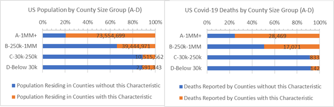
New York state accounts for 6% of the US population and disproportionately more covid-19 deaths, so it is useful to consider total US results excluding New York state. This is done in the chart below which shows a disproportionate majority of covid-19 deaths occurring suburban B Counties across the US but excluding New York State (second bar on right graph).
US Population and Covid-19 Deaths by County Size Group — Excluding NY State
What Next?
In future reports we’ll continue to examine county health statistics that might help put covid-19 statistics in a helpful light.
Some other measures that may tell the developing covid-19 story:
- How do results compare if we adjust the data to look at covid-19 deaths for each County one month after the first one was reported?
- Do Counties’ previous flu or respiratory deaths tell us about County covid-19 death rates?
- Do County median income or education tell us about the likelihood of covid-19 deaths?
- Do results change if we use the exact density of County population instead of County Size?
- Do average temperatures or levels of particulate matters matter?
- How do 2016 voter preference associate with covid-19 deaths?
If you have any questions about this analysis or the data, or if you have suggestions, please don’t hesitate to contact me.
-Pete
Sources: US Census, USA Facts Covid-19, IHME forecasts, US Cancer Deaths NIH 5 year average, CDC Handbook on Death Reporting, 2003; New York Times; Median Income; CDC Wonder Detailed Mortality; CDC Fine Particulate Matter 2003–2011