This US County health analysis is dedicated to individuals who are the victims of the Covid-19 virus and to all the people working hard to keep our US Counties safe and nourished.
Russ Abraham, 70, Fair Oaks, CA. The former students, their families and healthcare workers gathered six feet apart at the top of the parking garage at San Juan Medical Center, singing to honor the life of the music teacher who became a mentor to many. LA Times.
Background
Marketers and medical examiners have a similar data challenge: medical examiners record data about a sequence of fatal conditions ultimately lead to a final cause of death, while marketers record data about each consumer’s exposure to their ads — digital ad views, TV ad views, and direct mail deliveries — that lead to a final purchase.
Medical Examiners’ reason for reporting cause of death, per the CDC, is:
To determine which medical conditions receive research and development funding, to set public health goals, and to measure health status at local, State, national, and international levels
Likewise, marketers want to learn about the effect of ad exposures to determine which made consumers more likely to buy. In practice, this is actually difficult for marketers to piece the influences of different ad exposures together. Rather than crediting all contributing factors the final attribution often goes to the one that made the “last touch”. In a similar sense, the medical examiner’s most important data is their final cause of death.
Chronic obstructive pulmonary disease (COPD) has respiratory symptoms similar to those associated with covid-19. Perhaps medical examiners under the influx of many covid-19 deaths could not know which disease to attribute the final cause of death.
Counties with a high incidence of respiratory disease might also seem vulnerable to covid-19 infection simply because a patient’s health is already compromised. In aggregate, though, this analysis shows they are not — where COPD deaths are high covid-19 deaths are low.
There are roughly 150,000 COPD deaths per year. By the end of 2020 covid-19 deaths may approach this number. In the final tally, might the similarity between COPD and Covid-19 symptoms result in data discrepancies? US medical examiners are likely not staffed up to handle the additional 100,000 deaths of the past two months but nevertheless these will determine how much US public health funding will be invested in future covid-19 and COPD research.
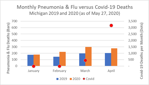
One brief example before moving on to look more closely at covid-19 deaths in Counties with high numbers of COPD. A recent state of Michigan report shows increased COPD deaths during the first 3 months of 2020 followed by a leveling off in April. In April Michigan suddenly had 3,000 covid-19 deaths. At the same time, a year-over-year increase in pneumonia and flu deaths was also reported with no leveling off in April. The first and second charts below show the COPD/pneumonia deaths (bars) and covid-19 deaths (dots).
Michigan Monthly COPD, Pneumonia, Flu, and Covid-19 Deaths: 2019 and 2020
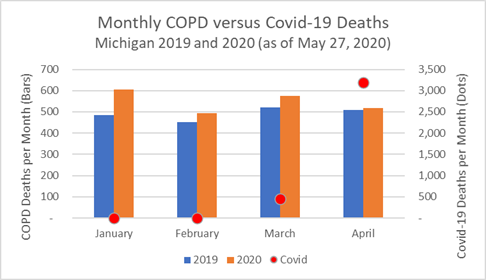
One can imagine that when medical examiners offices were deluged by unexpected covid-19 cases in April a small number of COPD deaths may have been mistakenly attributed to the covid-19 total. Or, would it be remotely possible that covid-19 struck earlier in the year and caused an uptick in deaths? That seems much less likely. In any case, we’ll leave it to the researchers applying for funding to quibble about the small potential discrepancies.
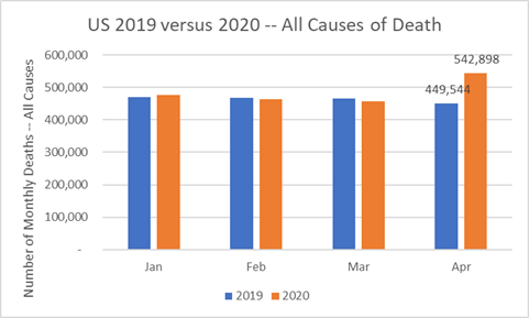
Looking at the entire US tells the bigger story. The CDC reports a large increase in number of deaths from all causes in April 2020 — nearly 100,000 more than in April 2019. The month of May will add significantly to the annual increase in deaths. Though not all will be attributed to covid-19 most will.
US Deaths — All Causes — January thru April for 2019 and 2020
Summary
COPD deaths are more common in small, rural Counties than in the rest of the US. These same Counties have been spared much of the ravages of covid-19. However, their public health programs and hospitals — engaged in fighting COPD — are also struggling when covid-19 infections do arise. This analysis examines covid-19 death rates in Counties with high incidence of COPD deaths, a disease most often associated with cigarette smoking, or working or living with chemical fumes, dust, and fine particulate matter in the air. Counties with a high incidence of COPD deaths have low covid-19 death rates, but appear to lose more covid-19 patients than other Counties when new cases are reported.
Analysis of Covid-19 Deaths — Data as of May 27, 2020
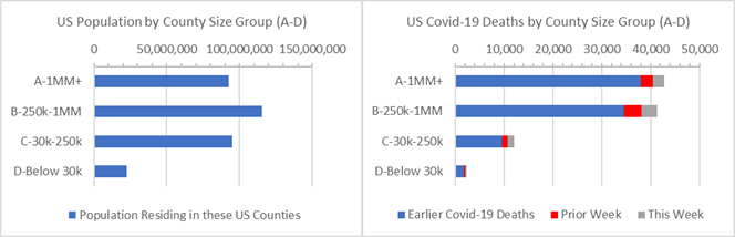
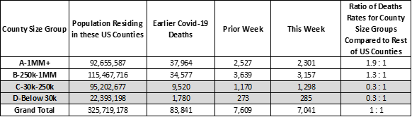
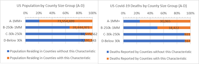
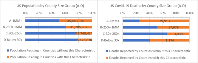
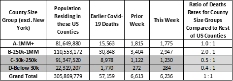
Covid-19 has heavily impacted 6 NY state counties. This especially affects the results of 44 large US metropolitan “A” Counties with 1 million residents or more. They account for 28% of the US population and 44% of covid-19 deaths — the covid-19 death rate for “A” Counties is 1.9 times larger than that of the rest of the country. This imbalance is due to New York state experience. Without New York state, the rate of covid-19 deaths for large “A” Counties is the same as it is for the rest of US Counties (see end of this Analysis for more on the measures used here).
A death rate imbalance is also apparent for “B” Counties with between 250,000 to 1 million residents. They have 1.3 times higher death rates per 10,000 residents than the rest of US Counties, and nearly 2 times higher death rates than the rest of the US when New York is excluded.
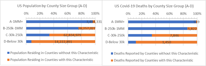
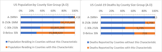
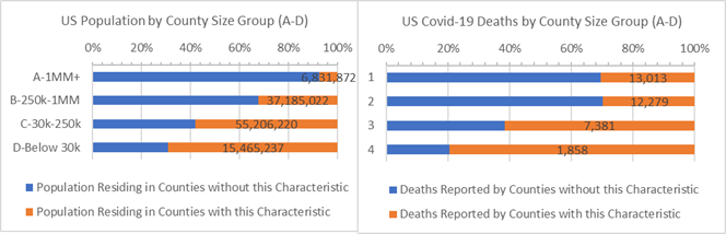
US Population and Covid-19 Deaths by County Size Group
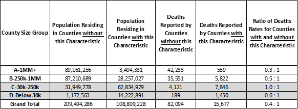
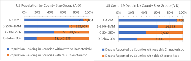
Altogether, 34% of the population live in Counties with above average COPD death rates but have experienced only 16% of the covid-19 deaths. COPD deaths are more common in small, rural Counties and most have been spared from covid-19 deaths. As indicated in the chart below, Counties with a high incidence of COPD deaths (“orange” bars) are mostly rural. They account for a relatively small number of covid-19 deaths — 15,677 out of 97,7791 (total for Counties where COPD death rate reporting is available from the CDC).
Population and Covid-19 Deaths for Counties that have death rates due to COPD 0.052% or more (orange)
Above average incidence of COPD deaths may appear to be a positive County health risk factor for covid-19 since these Counties have lower Covid-19 death rates than the rest of the US. However, given that covid-19 is a respiratory illness, one might expect Counties with high COPD death rates to also struggle with covid-19.
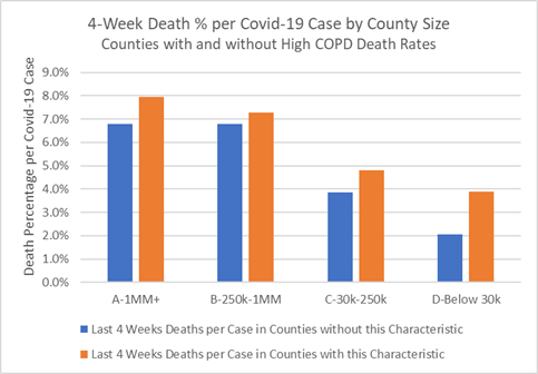
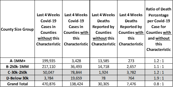
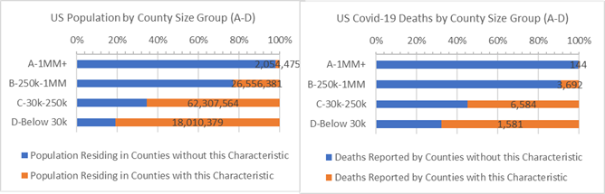
This can be examined by looking a recent covid-19 cases. In fact, when Counties with above average COPD death rates report covid-19 cases there is an increased chance of death. The chart below shows covid-19 deaths in the past 4 weeks as a percentage of new cases. They are highest for Counties with above average COPD death rates (“orange” bars). In other words, Counties that struggle with high COPD death rates also have poor success saving lives among new covid-19 cases though they do not occur often.
Last 4 Weeks Deaths as a Percentage of New Covid-19 Cases for Counties that have death rates due to COPD 0.052% or more (orange)
Public health programs and hospitals engaged in fighting COPD and other respiratory illnesses are struggling to save covid-19 patients. As each new covid-19 case presents itself Counties with above average COPD death rates are less likely to prevent death as compared to Counties where COPD is less of a public health problem.
The vast majority of the US population living with high COPD death rates reside in small, rural “C” and “D” Counties where the virus has a weak foothold. Still, Counties of all sizes are vulnerable to the virus and should invest in public health responses to respiratory disease — and especially in covid-19 contact tracing and mitigation programs in the months to come — before the death toll rises further. Attributing further medical examiner data to covid-19 is not needed to justify this spending.
Analysis Approach
This is one of a series of analyses that relate covid-19 deaths to key County health and demographic characteristics, including risk factors such as cancer death rates or percent of adults over 60. Each analysis focuses on the Counties’ risk factors that are higher than some “average”. The “average” is defined here as the characteristic’s incidence or percentage — for example, average cancer death rate or percentage of adults over 60 — and this risk group of Counties accounts for roughly 1/3rd of the US population when pooled together. Covid-19 deaths are then totaled for Counties with and without the risk factor.
Side-by-side bar charts illustrate how Counties are faring in the covid-19 crises when grouped by size of population and median income and split by above and below some average for a risk factor.
Covid-19 death rates for resulting 1/3 versus 2/3 population comparisons are then written as a ratio, such as, 0.5 : 1. Of course, the death rate ratios change as the data changes. For example, a 0.8 : 1 ratio compares the covid-19 death rates for Counties with and without the above average percent adults over age 60 risk factor. All things being equal, a 1.0 : 1 ratio means the covid-19 death rates match the ratio of the County populations. Typically it does not.
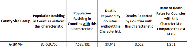
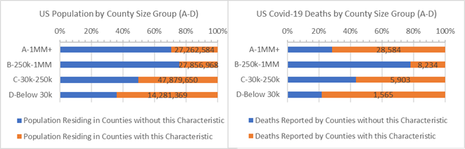
Here’s an example. The rate of covid-19 deaths is deaths divided by population. It’s 0.03% today, meaning 3 out of 10,000 US residents have died due to covid-19. In these studies we compare death rates for groups of Counties with and without the risk factors in a covid-19 death rate ratio. It is an “odds” ratio of death occurring with and without the risk factor. The 1.2 : 1 ratio below is a comparison of the death rates between “A” Counties with and without above adult age 60 risk factor. The ratio of the death rates is 1.2 = (3,522 /7,585,831) / (33,043/ 85,069,756). It tells us that the odds of dying from covid-19 are 20% higher for populations in large “A” Counties with above average adult age 60 populations.
Example: “A” Counties where Adult Age 60+ is 23% or more of County Population
Update on Past Analyses
Above Average White American, Hispanic American and African American Counties.
Counties with above average White American populations (85% or more White American) have 70% fewer deaths per 10,000 residents than all remaining US Counties (0.3 : 1 ratio).
Counties where White Americans are 85% or more of the population (orange)
Counties with above average Hispanic American populations (18% or more Hispanic American) have 90% more deaths per 10,000 residents than other Counties to have covid-19 deaths (1.9 : 1 ratio).
Counties where Hispanic Americans are 18% or more of the population (orange)
Counties with above average African American populations (13% or more African American) have 140% more deaths per 10,000 residents than other US Counties (2.4 : 1 ratio).
Counties where African Americans are 13% or more of the population (orange)
Age 60+. 35% of the US population live in older Counties defined as above average Age 60+ populations (orange bars on the left graph). Since 8 of 10 covid-19 deaths are adults 65 years and older Counties with above average Age 60+ populations, especially “C” and “D” Counties, are vulnerable in the covid-19 crisis (and other health risks, as well).
Counties where Adult Age 60+ is (orange) or is not (blue) 23% or more of population by County Size
Heart Disease. It may seem like heart disease is a “city problem”, but it is mainly because most covid-19 deaths are found in counties with above average heart disease deaths. But, large populations in rural “C” and “D” Counties also have the heart disease risk factor and above average covid-19 death rates, as well.
Counties where Heart Disease causes 0.2% or more population deaths (orange) or not (blue)
Cancer. Above average Cancer death Counties (orange bars in the charts) account for 38% of the US population and 30% of covid-19 deaths. When New York state is removed, Counties with the Cancer risk factor have 10% higher covid-19 death rates than the remaining US Counties.
Counties where Cancer causes 0.19% or more population deaths (orange) or not (blue) by County Size
Diabetes. Public health and health services in some large Counties and many small, rural Counties with high diabetes incidence are also fighting with relatively high covid-19 death rates.
Counties where Diabetes Incidence are 8% or more of the population (orange)
Voting Majority. Strong majority republican voting Counties have lower covid-19 death rates than the rest of the US. These positive outcomes occur across smaller, rural County sizes but also all income bands. Counties with strong majority democratic voting have extraordinarily high covid-19 death rates. These are mostly large Counties and those with low median incomes are particularly impacted.
Population and Covid-19 Deaths for Counties where Major Party Votes were over 54.1% Republican (orange)
Population and Covid-19 Deaths for Counties where Major Party Votes were over 58% Democratic (orange)
More on County Groups, more on the US Excluding NY
3,142 US Counties are geographic and administrative districts for which many convenient statistics are gathered, including covid-19 deaths. Each County can be characterized as urban and rural and they range in population from 10.2 million (LA County, CA) down to 88 (Kalawao County, HI) residents. In these reports, comparisons are made between four groups of counties depending on population size and by median income bands, as indicated in the chart axes.
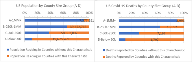
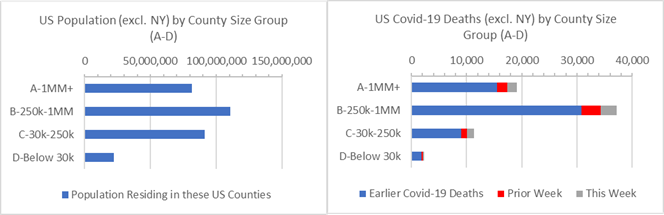
New York state accounts for 6% of the US population and disproportionately more covid-19 deaths. At time it is useful to consider total US results excluding New York state. The chart below shows a disproportionate majority of covid-19 deaths occurring suburban “B” Counties when New York State is excluded (second bar on right graph). Nationwide covid-19 death rates are 0.02% when New York state is excluded, compared to 0.03% overall.
US Population and Covid-19 Deaths by County Size Group — Excluding NY State
What Next?
In future reports we’ll continue to examine county health statistics that might help put covid-19 statistics in helpful light.
Some other measures that may tell the developing covid-19 story:
· How do Covid-19 deaths change when adjusted for the first date one was reported?
· Do Counties’ previous flu or respiratory deaths tell us about County covid-19 death rates?
· Do County median income or education tell us about the likelihood of covid-19 deaths?
· Do results change if we use the exact density of County population instead of County Size?
· Do average temperatures or levels of particulate matters matter?
If you have any questions about this analysis or the data, or if you have suggestions, please don’t hesitate to contact me.
-Pete
Sources: US Census, USA Facts Covid-19, IHME forecasts, US Cancer Deaths NIH 5 year average, CDC Handbook on Death Reporting, 2003; New York Times; Median Income; CDC Wonder Detailed Mortality; CDC Fine Particulate Matter 2003–2011; MIT Election Data + Science Lab; State of Michigan Monthly Deaths;