Acknowledgment
This US County health analysis is dedicated to individuals who are the victims of the Covid-19 virus and to all the people working hard to keep our US Counties safe and nourished.
“Chance favors the prepared mind.” — Louis Pasteur, 1822–1895, French biologist, microbiologist and chemist renowned for his discoveries of the principles of vaccination, microbial fermentation and pasteurization.
Background
In marketing, the word “free” sells. Free offer incentives acquire new customers in droves. They can also be costly and may retain relatively few customers of value. For example, free bonus points may deliver the desired number of new credit card applicants but include many that are costly one-time transactors. Public health productivity goals may also result in sub-optimal outcomes where increased quantity lessens overall public health quality.
Each year public health officials plan for seasonal flu. They alert the public about the viruses that will infect about 50 million and result in death for 60,000 according to the Center for Disease Control (CDC). Importantly, flu vaccines are credited with lowering infections, hospitalizations, and deaths by 10–15% each year. They are rightfully considered important and flu shot coverage of Medicare adults contributes positively County Health Rankings as reported by The University of Wisconsin Population Health Institute, County Health Rankings & Roadmaps 2020 (www.countyhealthrankings.org). But overall health quality can also be measured against the number of covid-19 cases and deaths an represents an opportunity to understand the extent to which flu shots to medicare adults benefit County residents.
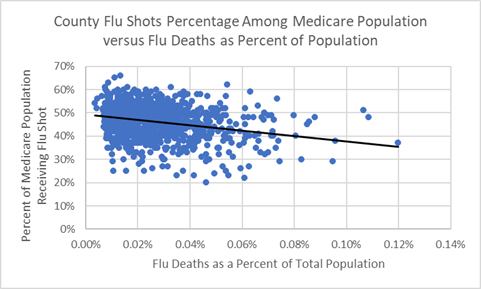
Flu shot are preventative health measures recommended for older, Medicare adults. Roughly ½ of the US population gets a flu shot each year and, during any given flu season, ½ of flu vaccines are effective. This means ¼ of the population will benefit — enough to “move the needle” as the chart below indicates.
The “black” trendline reflects flu shot associations with flu deaths. In this chart all 3,100+ US Counties are treated equally regardless of size. It is a negative relationship: as the proportion of flu shots goes down, the relative number of flu deaths goes up, and vice versa (correlation = -.09). However, when County population size is thrown in the relationship is actually weaker and the trendline flattens (weighted correlation = -.02 where correlation = .00 would mean no relationship).
Medicare Flu Shot Percentage and Flu Deaths as Percentage of Population
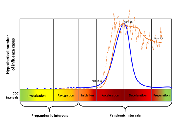
The US population is expecting a more effective covid-19 vaccine. Currently, in part because no vaccine exists, new covid-19 cases in the US population and globally will continue for months to come. By way of comparison, the trendline for the 2-week average of new cases (“orange”) is plotted over the CDC Pandemic Strategy trendline (“blue”) illustrating the CDC’s hypothetical new cases in a pandemic and used for planning purposes.
CDC Framework for novel influenza virus pandemics (solid “blue” line) compared to Actual US 14-day running average of new covid-19 cases through 6/6/2020 (solid “orange” line)
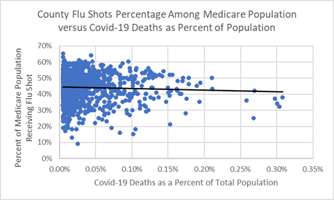
Perhaps because the level of Medicare flu shot coverage may be driven by public health quantity policies and perhaps not administered with accompanying hand hygiene and social distancing education they do not appear to strongly improve overall County public health quality — at least, not in the face of the covid-19 pandemic. The flat trendline across all levels of County Medicare flu shot coverage indicates Counties’ capabilities to administer flu shots have no bearing on their ability to hold down covid-19 death rates.
Medicare Flu Shot Percentage and Covid-19 Deaths as Percentage of Population
The Medicare population are age 65 and older residents and are vulnerable. It is important for many to get flu shots. They also account for 80% of covid-19 deaths — primarily because many suffer from secondary health conditions. A County proactively administering flu shots to seniors with secondary health conditions and educating about social distancing, isolation, and hand hygiene might be following best practices for County public health.
The elderly do trust public health officials to protect them and their families. Yet many may feel their government failed to prepare for a pandemic. On the other hand, some may recognize that the pandemic outcome would have been worse were it not for our government’s mitigation efforts.
The Appendix below provides more insights into County medicare flu shots, as potentially positive health risk factors associated with covid-19 outcomes. Unfortunately, the quantity of flu shots administered is not associated with lowering the covid-19 spread — and, potentially, the overall quality of this aspect of public health care.
Appendix — Analysis
Summary
One public health competency is the ability to treat a County’s aging Medicare population with flu shots. It stands to reason that this County public health capability might indicate its ability to better protect its most vulnerable population from covid-19 infections and deaths.
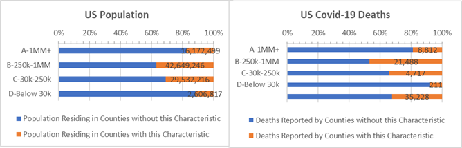
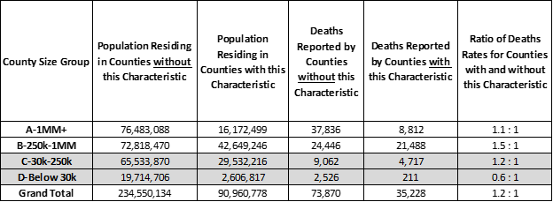
But only a small number of the largest 1 million resident Counties, representing 5% of the US population, delivered flu shots to over 50% of its Medicare population and are also able to report lower deaths among known covid cases. In fact, on average, The Counties that treat more of their Medicare population with flu shots have 1.2 times more covid-19 deaths per 10,000 people than the rest of the US.
Analysis of Covid-19 Deaths — Data as of June 10, 2020
Counter to our expectations, a larger share of covid-19 deaths occur in Counties where half or more Medicare residents receive flu shots (highlighted by “orange” bars in the chart below). These Counties have 1.2 times more covid-19 deaths per 10,000 people than Counties that treat a smaller portion their Medicare population with flu shots. This trend is particularly true for mid-size “B” Counties, with between 250,000 and 1 million residents, where 1.5 times more covid-19 deaths occur per 10,000 in Counties which have above average flu shot coverage.
Counties where 50% or more of Medicare residents received a Flu Shot — Percentage of population and Percentage of covid-19 deaths (“orange” bars)
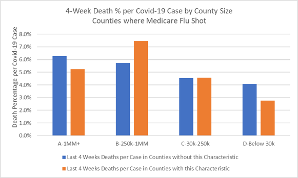
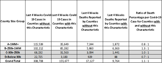
Furthermore, for newly confirmed covid-19 cases (in the past 2–6 weeks), the “B” Counties with above average Medicare flu shots report 1.3 times higher chances of death per covid-19 case as compared to “B” Counties with low rates Medicare of flu shots. In the chart below the second large “orange” bar represents more deaths per 100 covid-19 cases in Counties with above average flu shots than the “blue” representing “B” Counties giving fewer flu shots. Interestingly, a small number of large “A” Counties that deliver above average flu shots are also able to hold down death rates among recent covid cases (the first “orange” bar is smaller the first “blue” bar).
Last 4 Weeks Deaths as a Percentage of New Covid-19 Cases for Counties that have 50% or more Medicare residents receiving a flu shot (orange) — By County Size
Working more closely with County data helps determine health risks and benefits during the covid-19 crisis. Given that flu shot coverage is not strongly associated with County health and may even have consumed resources needed to better prepare for covid-19, this County data — in our data-driven world — may not tell the complete story. While on the surface flu shot coverage should be positive, it may serve as a “metric” reflective of public health growth goals that do not translate into improved overall health care quality. Expecially, in “B” Counties where high flu shot coverage is associated with higher covid-19 deaths, some investment in educating Medicare adults on social distancing and washing hands might have done better to lower flu infections and, conceivably, might have prepared better for covid-19.
When public health organizations administer flu vaccines without also giving guidance on hand sanitation, isolation, and distancing measures perhaps they have in part reached for “quanity” goals over “quality” outcomes may possibly have lost an opportunity to perform better in the face of the pandemic.
Counties are struggling to save the lives of covid-19 patients and are continuing to respond with pandemic-specific public health services. And, yet, as with advertising where optimizing quantity and quality is achieved with data, public health officials will also improve on the outcomes using data, and not concur with the health care version of this advertising phrase coined by John Wannamaker, a pioneer in marketing who might have said: — “half of our flu vaccines will work, we just don’t know which half!”
Analysis Approach
This is one of a series of analyses that relate covid-19 deaths to key County health and demographic characteristics, including risk factors such as cancer death rates or percent of adults over 60. Each analysis focuses on the Counties’ risk factors that are higher than some “average”. The “average” is defined here as the characteristic’s incidence or percentage — for example, average cancer death rate or percentage of adults over 60 — and this risk group of Counties accounts for roughly 1/3rd of the US population when pooled together. Covid-19 deaths are then totaled for Counties with and without the risk factor.
Side-by-side bar charts illustrate how Counties are faring in the covid-19 crises when grouped by size of population and median income and split by above and below some average for a risk factor.
Covid-19 death rates for resulting 1/3 versus 2/3 population comparisons are then written as a ratio, such as, 0.5 : 1. Of course, the death rate ratios change as the data changes. For example, a 0.8 : 1 ratio compares the covid-19 death rates for Counties with and without the above average percent adults over age 60 risk factor. All things being equal, a 1.0 : 1 ratio means the covid-19 death rates match the ratio of the County populations. Typically it does not.
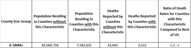
Here’s an example. The rate of covid-19 deaths is deaths divided by population. It’s 0.03% today, meaning 3 out of 10,000 US residents have died due to covid-19. In these studies we compare death rates for groups of Counties with and without the risk factors in a covid-19 death rate ratio. It is an “odds” ratio of death occurring with and without the risk factor. The 1.2 : 1 ratio below is a comparison of the death rates between “A” Counties with and without above adult age 60 risk factor. The ratio of the death rates is 1.2 = (3,522 /7,585,831) / (33,043/ 85,069,756). It tells us that the odds of dying from covid-19 are 20% higher for populations in large “A” Counties with above average adult age 60 populations.
Example: “A” Counties where Adult Age 60+ is 23% or more of County Population
More on County Health Risk Factors
Population Density and Distance to Supermarkets — How much covid spread is there when the majority of County households are clustered near supermarkets?
Respiratory Disease — How are small, rural Counties with high rates of COPD surviving the ravages of covid-19?
Strong Voting Party Majorities — What does loyal presidential party voting deliver to Counties in the time of covid-19?
Diabetes Incidence — How are Counties with high Diabetes rates faring during the crisis?
Above Average White, Hispanic, and African American Counties — If all men and women are created equal, what would make the Counties they live in more equitable?
Sources: US Census, USA Facts Covid-19, IHME forecasts, US Cancer Deaths NIH 5 year average, CDC Handbook on Death Reporting, 2003; New York Times; Median Income; CDC Wonder Detailed Mortality; CDC Fine Particulate Matter 2003–2011; MIT Election Data + Science Lab; Michigan Monthly Deaths; Testing from Covid Tracking Project