Acknowledgment
This US County health analysis is dedicated to individuals who are the victims of the Covid-19 virus and to all the people working hard to keep our US Counties safe and nourished.

Background
The risk of covid-19 death is not equitable and increases with population density. Someone who is contagious with the coronavirus walking in a crowd is a risk to themselves and others. Like someone with a loaded gun or a teenager driving in a crowd, the actuarial odds of someone who is infectious are frighteningly high. 80% of the time there is no problem — the other 20% of the time is a disaster. Family and friends may die, the carrier, too. And we don’t know which 20% are the high-risk cases. It would be best if everyone gets tested, and best if everyone gets licensed.
Population density is a risk factor because it can lead to community spread of the covid-19 disease. Since infections come from sustained close contact they are known to occur more easily when people are clustered together. From a covid-19 perspective Nevada should be considered a dense population with potential health risk. While the US military used great swaths of Nevada to test atom bombs, Nevada’s cities are large and tightly packed, and subject to the risk of community transmission. The vast majority of the Nevada population is clustered into large towns. More specifically, while Las Vegas tourists bring their gambling dollars to the city, the city will be gambling with virus infections that tourists may spread to its population. What happens in Vegas…
To capture clustered population density from a perspective of covid-19 risk this analysis takes advantage of US Department of Agriculture data which provides County populations that travel under (or over) 1 mile to visit a supermarket. A highly clustered population — living within 1 mile of a supermarket — is also one that lives close to restaurants, community centers, hospitals, churches, and nursing homes. All things being equal, the larger the share of residents living in areas clustered near supermarkets, the larger the risk of a covid-19 infection.
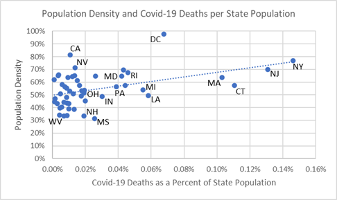
The chart below uses this supermarket distance yardstick to show population density and its association with covid-19 death rates. The upward sloping trendline indicates that densely populated states, like New York (NY), have both high density and high covid-19 death rates — the numbers of covid-19 deaths taken as a percentage of the size of state population. There are exceptions: California (CA) and Nevada (NV) in the upper-left of the chart are densely populated but have low death rates.
Population Density of States and Covid-19 Death Rates
This indicates that public health risk of covid-19 is not only explained by population density but, of course, also by each state’s public health mandates on social distancing and testing. Consider the series of events that occurs with each case: exposure, incubation, infection, infection of others, testing, hospitalization, and final outcome. Interventions, such as social distancing, testing, contact tracing, and quarantining, each have an effect on overall covid-19 public health outcomes.
If nothing were done to combat the virus — as some proposed but ended up delaying the US public health — then population density by itself would explain more transmissions, infections and deaths. Since public health officials are engaged to protect community health, they tested early, isolated cases, cared for them, and avoided even more hospitalization and lowered covid-19 deaths.
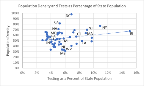
High testing rates are also associated with high density states as the upward trendline in the next chart shows. Testing interventions among densely populated New England states — where the virus has its US epicenter — is exemplified by Rhode Island (RI) which reports extensive testing compared to neighboring states. States in US’s covid epicenter are densely populated and many have high testing rates (to the right side of the chart). Some high density states do not report high testing rates — California (CA) and Nevada (NV) — but have likely taken other public health measures to keep infection spread and deaths low. Las Vegas is cautiously welcoming back patrons as of June 4.
Population Density of States and Percent Tested
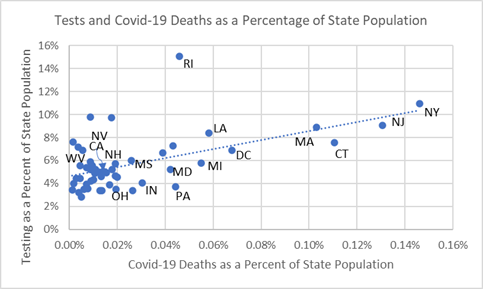
Finally, there is a relationship between testing and covid-19 death rates, as the following chart shows. When testing is done aggressively, it is associated with lower death rates, and reflected in the upward sloping trendline. Rhode Island’s aggressive testing strategy is associated with few covid-19 deaths as a percentage of its population and undoubtedly made it safer than other New England states during the crisis, shown to the right in the chart.
The chart’s trendline between testing rates and death rates could indicate to public health officials where more testing may be advised. Pennsylvania (PA), Michigan (MI), Maryland (MD), Colorado (CO), Indiana (IN), and Ohio (OH) have high death rates from covid-19 but relatively low testing — and, as shown in the previous two charts, these state have relatively high population density.
Percent of State Population Tested and Covid-19 Death Rates
Some may argue that this observational study only shows that Rhode Island tested more than necessary. Ultimately, especially where population density is high, erring on the side of too many tests and interventions — including social distancing, contact tracing and quarantining — will most likely put the country back onto the quickest road to a healthy, sustainable recovery.
The following analysis of US Counties provides more insight into population density as a health risk factor and covid-19 outcomes.
Summary
Community transmission occurs when residents are in close contact with each other and naturally increases with high density populations clustered together. These conditions also lead County public health officials to make interventions, including social distancing, testing and contact tracing, to combat the health risks of high population density. In the largest US Counties this will be an ongoing public health effort in the months to come. However, with the safety from covid-19 infection that comes from living in a sparsely populated County comes a risk that when covid-19 disease strikes it is more often fatal perhaps because of poor hospital access.
Analysis of Covid-19 Deaths — Data as of June 2, 2020
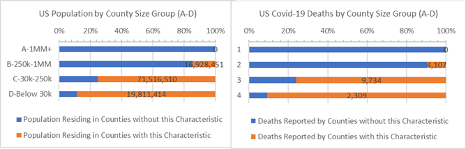
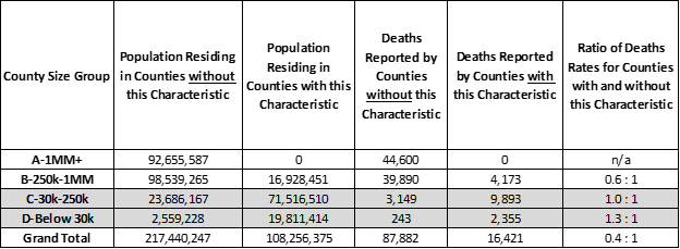
33% of the US population live in sparsely populated, low density Counties where half or more residents must travel over 1 mile to shop at a supermarket for food (highlighted in “orange” bars in the chart below). None of these are large 1 million and over “A” Counties. Of concern, the most sparsely populated, rural “D” Counties have 30% higher death rates than the rest of “D” Counties — 1.3 times more deaths per 10,000 people occur in low density “D” Counties than high density “D” Counties where populations are more clustered. As of today, rural “D” Counties have only 2% of all US covid-19 deaths, so perhaps these 2,309 deaths are less of a concern but this is more than the entire country of Switzerland and may be instructive to understand why death rates are lower in densely populated “D” Counties and higher in sparsely populated “D” Counties.
Sparse Populations and Covid-19 Deaths for Counties where 50% or more residents must travel 1 mile or more to get to a supermarket (orange)
Highly dense populations, such as those in “A” and “B” Counties, have the most Covid-19 deaths and higher deaths per 10,000 residents than the rest of the US. County public health official aggressive testing interventions designed to minimize these risks, and may be paying off. In fact, for all covid-19 cases reported death rates are lower in the most densely populated Counties, and the least densely populated Counties are struggling to saving lives when cases are identified. Most likely, in the rare cases where infections occur and travel distances for hospital care is long, the prospects of surviving the infection decrease.
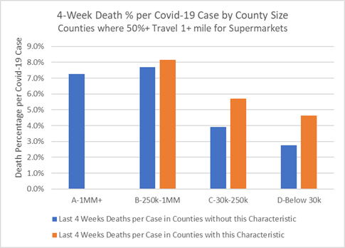
As the chart below illustrates, when cases are reported in sparsely populated Counties there is an increased chance of death for each case (“orange” bars). Counties with the most remote population have poorer success saving lives among new covid-19 cases. For example, as the table shows, 50% more residents per 10,000 who test positive for covid-19 in sparsely populated “C” Counties will die compared to other “C” Counties that have more clustered, dense populations. While they have fewer cases overall, the disadvantage of rural populations is that they do not have nearby medical facilities and public health services. Once a case is confirmed, Counties with more dense populations (“blue” bars) — and, presumably, better hospital access — report fewer deaths.
Last 4 Weeks Deaths as a Percentage of New Covid-19 Cases for Counties that have Sparse Populations where 50% or more residents must travel 1 mile or more to get to a supermarket (orange)
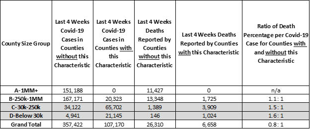
Over the past 4 weeks, approximately 20% of positive covid-19 tests and deaths occur in sparsely populated, less dense US Counties. Public health programs and hospitals in sparsely populated Counties are struggling to save the lives of covid-19 patients and must respond with better hospitalization and care.
Counties of all sizes are vulnerable to the virus. Public health programs should prepare residents to be proactive because the onset of covid-19 symptoms requiring medical care happens in days. While food shopping in your County can leave you hungry, there’s a fair bet County hospital services will leave you hurting.
Analysis Approach
This is one of a series of analyses that relate covid-19 deaths to key County health and demographic characteristics, including risk factors such as cancer death rates or percent of adults over 60. Each analysis focuses on the Counties’ risk factors that are higher than some “average”. The “average” is defined here as the characteristic’s incidence or percentage — for example, average cancer death rate or percentage of adults over 60 — and this risk group of Counties accounts for roughly 1/3rd of the US population when pooled together. Covid-19 deaths are then totaled for Counties with and without the risk factor.
Side-by-side bar charts illustrate how Counties are faring in the covid-19 crises when grouped by size of population and median income and split by above and below some average for a risk factor.
Covid-19 death rates for resulting 1/3 versus 2/3 population comparisons are then written as a ratio, such as, 0.5 : 1. Of course, the death rate ratios change as the data changes. For example, a 0.8 : 1 ratio compares the covid-19 death rates for Counties with and without the above average percent adults over age 60 risk factor. All things being equal, a 1.0 : 1 ratio means the covid-19 death rates match the ratio of the County populations. Typically it does not.
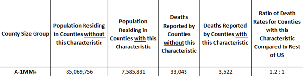
Here’s an example. The rate of covid-19 deaths is deaths divided by population. It’s 0.03% today, meaning 3 out of 10,000 US residents have died due to covid-19. In these studies we compare death rates for groups of Counties with and without the risk factors in a covid-19 death rate ratio. It is an “odds” ratio of death occurring with and without the risk factor. The 1.2 : 1 ratio below is a comparison of the death rates between “A” Counties with and without above adult age 60 risk factor. The ratio of the death rates is 1.2 = (3,522 /7,585,831) / (33,043/ 85,069,756). It tells us that the odds of dying from covid-19 are 20% higher for populations in large “A” Counties with above average adult age 60 populations.
Example: “A” Counties where Adult Age 60+ is 23% or more of County Population
Want More?
Covid-19 Deaths by County Health Risk Factors — Respiratory Disease — How are small, rural Counties with high rates of COPD surviving the ravages of covid-19?
Covid-19 Deaths by County Health Risk Factors — Strong Voting Party Majorities — What does loyal presidential party voting deliver to Counties in the time of covid-19?
Covid-19 Deaths by County Characteristic — Diabetes Incidence — How are Counties with high Diabetes rates faring during the crisis?
Covid-19 Deaths by County Characteristic — Above Average White, Hispanic, and African American Counties — All men and women are created equal. What could make the Counties they live in more equitable?
Data Sources
US Census, USA Facts Covid-19, IHME forecasts, US Cancer Deaths NIH 5 year average, CDC Handbook on Death Reporting, 2003; New York Times; Median Income; CDC Wonder Detailed Mortality; CDC Fine Particulate Matter 2003–2011; MIT Election Data + Science Lab; Michigan Monthly Deaths; Testing from Covid Tracking Project