Marketers and medical examiners face a similar challenge: both measure outcomes that may be attributed to multiple causes. And, for medical examiners, it’s a matter of life and death.
Trends in US County Medical examiners’ figures reported to the CDC are clear enough to give a rough estimate of how many will die of Covid-19 by year end. In addition, there are “excess deaths” to consider — those assigned to secondary or unknown causes which may include people who have died with the disease but were not tested.
Marketers would tend to attribute any incremental outcomes, such as excess sales, to the factors that changed. If advertising is targeted in TV ads, email, and display ads on phones, and sales suddenly increase after the addition of, let’s say, postal mailings, then the postal mail would get credit for the excess sales, all other things being equal.
Even though it may or may not have had the last touch,
it makes sense to attribute the main effect to what changed, though minor adjustments for population and timing could also be considered. Recent CDC data on deaths from all causes over the past 4 years is summarized in the chart below. What changed in 2020 is Covid-19 which was accompanied by a sub-par public health response when compared to other countries.
Number of Average US Deaths from March to mid-August for all Causes — 2020 “Excess” is Highlighted
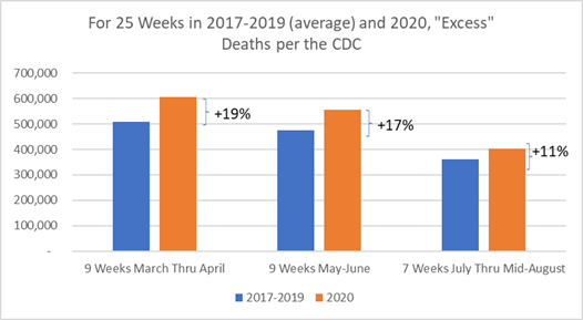
At the risk of over-simplifying cases and deaths for July and August were stable so let’s just assume that this recent trend continues . It’s not unreasonable since schools are open and summer is a thing of the past, There will be more indoor encounters and a higher likelihood of transmission. While we know there will be up’s and down’s this fall, if we use the July-August average of 669 daily deaths for the 20 weeks that remain, we get an expected total of 267,000 Covid-19 deaths in 2020 . Taking all the excess deaths into account, which is reasonable, we end up with an estimated total of 335,000.
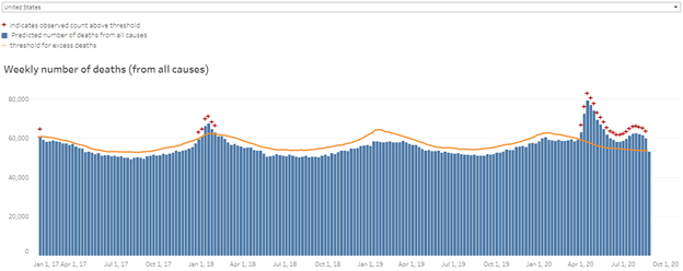
The CDC illustrates the pandemic in a chart that contrasts all deaths reported since 2017. 2020 weekly deaths are flagged because they are above a 95% confidence interval (orange “+” signs) due to Covid-19 for what was reasonably expected. They were also above threshold in early 2018 due to a bad flu outbreak. Something unusual is going on and it has been statistically validated.
To quantify how much a new marketing channel may contribute, sales in paired cities, let’s say St. Louis and Pittsburgh, can be compared during a period when postal mail is included for St. Louis customers but not for Pittsburgh. The test can then be flipped and all the effects compared. We can’t do such a controlled test in a pandemic, of course. However, this testing is similar to the controlled vaccine trials going on now.
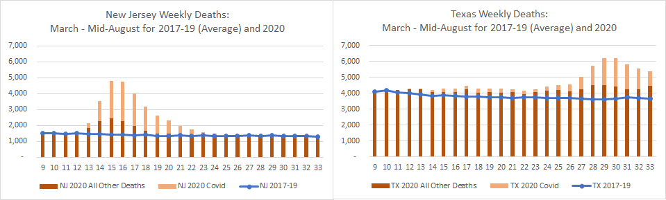
Instead, year-over-year observed deaths are used. To illustrate the recent excess deaths reported weekly for New Jersey and Texas are plotted in the charts below. Total excess deaths over these past 25 weeks are comparable at 17,512 and 18,995 for New Jersey and Texas, respectively. But, to date, New Jersey attributes 81% of the excess deaths to Covid-19 while Texas attributes 65% to Covid-19. This may be a timing issue but in any case the excess deaths are significant.
New Jersey and Texas Weekly Deaths from March thru Mid-August for 2017-2019 (average blue line) and 2020 (Light bar=Covid-19 deaths, Dark bar=Deaths due to all other causes)
Heart disease and cancer each claim 600,000 US deaths annually. In 2021 some of these numbers might be lower due to so many Covid-19 deaths. Applying recent July and August death rates to a theoretical 52 week year gives an estimate of 244,000 Covid-19 US deaths. That’s a quarter of a million — anyway you look at it.