Acknowledgment
This US County health analysis is dedicated to individuals who are the victims of the Covid-19 virus and to all the people working hard to keep our US Counties safe and nourished.
Wilson Roosevelt Jerman, who served as a White House butler for more than five decades, has died of COVID-19 at the age of 91. Granddaughter Jamila Garrett said she wants the world to remember her grandfather as a man who was really authentic. “That is what he taught our family, that’s what drives throughout our family and that’s what we will continue throughout his legacy.” — The Hill
Summary
Good data is not always easy to come by. But County data is often good and can help lead to good decisions. For example, public health officials use data to engage communities, schools, and families to reduce chlamydia. And the data show that these Counties also tend to have relatively high covid-19 death rates per 10,000 residents. Counties with high incidence of chlamydia should be wary of covid-19 and redouble efforts to change health behaviors to keep community transmission of covid-19 low.
Background
Data issues “skipped over” in marketing and analytics campaigns can result in bad business decisions. Take digital advertising ad fraud, for example. It biases views and click thru data that advertisers use to judge the reach of their ads because their fake audiences — the views and clicks are done by money making computer programs (“bots”) not humans. This bad data leads to bad decision making but, even when it is recognized, advertisers and agencies still do not invest enough resources to eliminate it, per my colleague Dr. Augustine Foo. It is surprising to see a data problem underlying data-driven marketing, but there it is: “garbage in, garbage out” as the expression goes.
Some public health measures may also “skip over” deep-rooted community and cultural factors that would better explain health outcomes. When its incomplete, County health data trends resemble playing with a stacked deck of cards — it can also lead to bad decisions.
The University of Wisconsin Population Health Institute, County Health Rankings & Roadmaps 2020 (www.countyhealthrankings.org) are impressive for the broad number of data sources they are based on. For example, Health Behaviors include Tobacco use, Diet & Exercise, Drugs & Alcohol, and Sexual Activity which is based on Chlamydia and Teen Births. Health Behaviors account for 30% of the overall County Health Ranking. The other County Health factors are Clinical Care, Social and Economic factors, and Physical Environment factors. The goal of all this is to rank Counties based on residents’ potential length of life and the quality of their mental and physical health.
CDC reports that Chlamydia is closely related to unplanned pregnancies. Both result from unprotected sex that, in turn, can end up impacting the health, economic and social well-being of these individuals, their families, and their communities. This stacks the decks against a County’s health ranking.
The data help guide public health officials to engage communities, schools, and families to “adopt and implement policies and programs that reduce” chlamydia and unplanned pregnancies. The better the data the better the chances of success.
It would make sense that these same Counties might be able to keep covid-19 death rates low through programs to control community transmission of the virus encouraging mask wearing, hand hygiene, isolating cases, and social distancing.
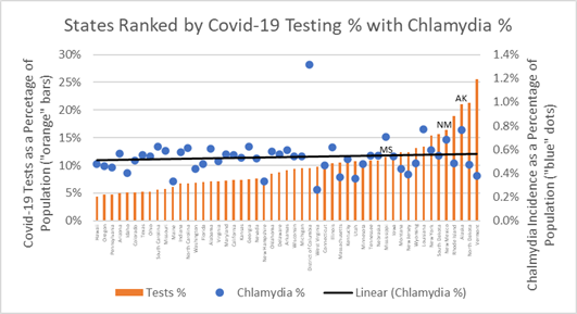
Testing, on the other hand, is a measure of clinical care — before and after a pandemic. In the midst of the pandemic, as shown previously, states that are post-surge test to monitor spread, while states experiencing growth in cases use testing to chase virus spread. The plot of chlamydia incidence for states ranked from low-to-high covid-19 tests percentage indicates a very weak association as reflected in the flatness of the trendline. No relationship with covid-19 testing is expected since testing is not causally related to covid-19 cases.
Chlamydia Percentage and Covid-19 Testing as Percentage of Population
If covid-19 infections are mainly caused by community spread then covid-19 public health measures should relate more to “health behaviors” and the incidence of chlamydia — both are caused by unsafe social interactions. The upward trendline in the chart below confirms this association between County chlamydia percentages and covid-19 death rates. Where we find one, we are likely to find the other.
Chlamydia Incidence versus Covid-19 Deaths as Percentage of Population
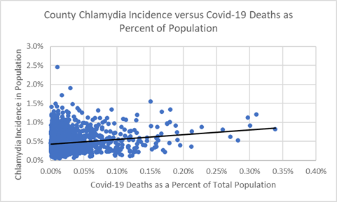
The data indicate a relationship: Counties with high incidences of chlamydia appear to have populations at risk for covid-19. Therefore, Counties that have not yet experienced high covid-19 infections ought to implement aggressive public health precautions, because covid-19 will find them.
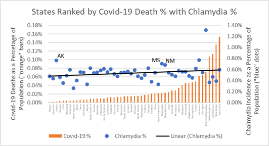
Some states may be doing this already. The chart below ranks states from low-to-high covid-19 deaths rates (deaths as a percentage of population) and displays state chlamydia percentage. Importantly, Alaska (AK), Mississippi (MS), and New Mexico (NM) have low covid-19 death rates as a percentage of their populations, relatively high incidence chlamydia, and — as shown in the chart above — high covid-19 testing rates which may be helping them monitor and stop the spread of the disease to their most vulnerable populations.
State Chlamydia Percentage versus Covid-19 Deaths as Percentage of Population
Populations at risk of chlamydia are also residents of counties most susceptible to covid-19 death. Policies and health behavior programs that educate about safe sex and social distancing are likely best practices needed to change social norms and improve County public health outcomes.
The section below provides more data and insights behind the chlamydia charts, seen as a potential County health risk factors associated with covid-19 outcomes. As in marketing, when the public health data is good, the decisions that use the data are likely to be good — even in Counties dealt a bad hand to begin with.
Behind the Charts — Data as of June 17, 2020
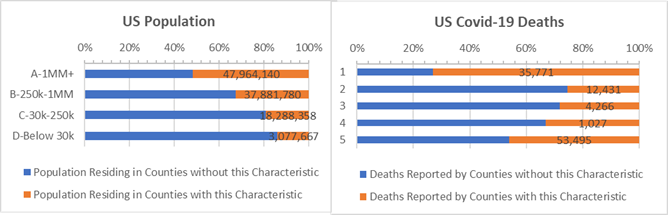
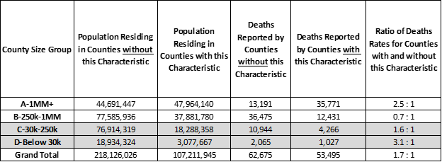
A larger share of covid-19 deaths occur in Counties where the incidence of chlamydia (highlighted by “orange” bars in the chart below) is high. These Counties have 1.7 times more covid-19 deaths per 10,000 people than Counties with low incidences of chlamydia. This is particularly true for the largest “A” Counties with over 1 million residents, but also in the smallest, rural “D” Counties with under 30,000 residents when they are compared to “A” and “D” Counties with below average chlamydia.
Counties where 0.6% or more of population test positive for chlamydia (“orange” bars) — by County Size
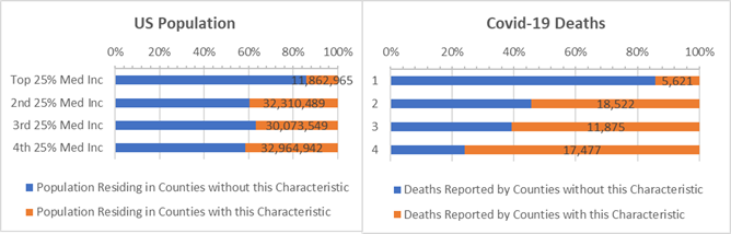
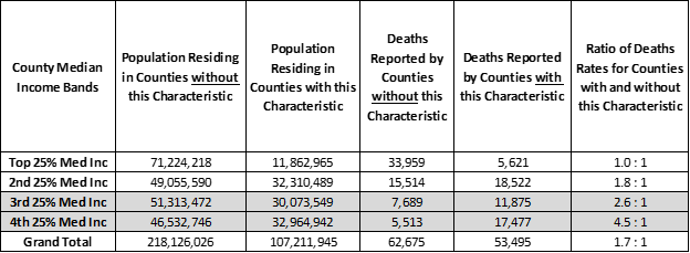
Income is also a factor. Counties with above average chlamydia have a “negative” association between median income and covid-19. Low income Counties with high chlamydia rates have high rates of covid-19 deaths per 10,000 residents. Most dramatically, 4.5 times more covid-19 deaths occur per 10,000 residents of low-income Counties with high chlamydia compared to low income counties where chlamydia is low (bottom “orange” bar on right in chart below).
Counties where 0.6% or more of population test positive for chlamydia (“orange” bars) — by Income Band
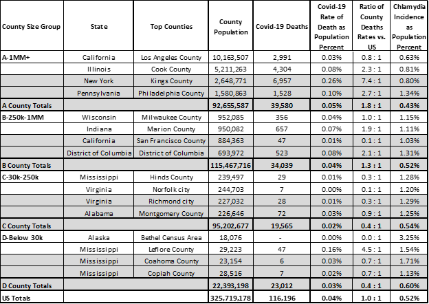
County health data helps understand the outcomes of the covid-19 crisis. Current covid-19 death rates are especially high in some Counties with high chlamydia rates. Pre the table below, the top ranking Counties for chlamydia with below average covid-19 death rates would be wise to redouble efforts to stop the spread — Counties such as: Los Angeles, San Francisco, Hinds, Norfold, Richmond, and Bethel.
Top Counties where Incidence of Chlamydia 0.6% or more of the population by County Size
When public health organizations give guidance on safe sex, they might also touch on hand sanitation, isolation, and social distancing. Any health behavior improvement may help a Count perform better in the face of the pandemic.
Unlike marketing and advertising executive who despite their efforts cannot overcome bad data caused by ad fraud, public health officials do have quality data they can use to implement effective covid-19 programs that will help their County residents overcome all odds and stay on the roadmap to health.
Analysis Approach
This is one of a series of analyses that relate covid-19 deaths to key County health and demographic characteristics, including risk factors such as cancer death rates or percent of adults over 60. Each analysis focuses on the Counties’ risk factors that are higher than some “average”. The “average” is defined here as the characteristic’s incidence or percentage — for example, average cancer death rate or percentage of adults over 60 — and this risk group of Counties accounts for roughly 1/3rd of the US population when pooled together. Covid-19 deaths are then totaled for Counties with and without the risk factor.
Side-by-side bar charts illustrate how Counties are faring in the covid-19 crises when grouped by size of population and median income and split by above and below some average for a risk factor.
Covid-19 death rates for resulting 1/3 versus 2/3 population comparisons are then written as a ratio, such as, 0.5 : 1. Of course, the death rate ratios change as the data changes. For example, a 0.8 : 1 ratio compares the covid-19 death rates for Counties with and without the above average percent adults over age 60 risk factor. All things being equal, a 1.0 : 1 ratio means the covid-19 death rates match the ratio of the County populations. Typically it does not.
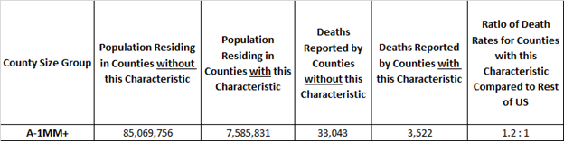
Here’s an example. The rate of covid-19 deaths is deaths divided by population. It’s 0.03% today, meaning 3 out of 10,000 US residents have died due to covid-19. In these studies we compare death rates for groups of Counties with and without the risk factors in a covid-19 death rate ratio. It is an “odds” ratio of death occurring with and without the risk factor. The 1.2 : 1 ratio below is a comparison of the death rates between “A” Counties with and without above adult age 60 risk factor. The ratio of the death rates is 1.2 = (3,522 /7,585,831) / (33,043/ 85,069,756). It tells us that the odds of dying from covid-19 are 20% higher for populations in large “A” Counties with above average adult age 60 populations.
Example: “A” Counties where Adult Age 60+ is 23% or more of County Population
Want More?
Testing Does Not Create Cases — Covid-19 Does! — Testing is a medical necessity to fight the covid-19 storm. It does not cause cases.
Population Density and Distance to Supermarkets — How much covid spread is there when the majority of County households are clustered near supermarkets?
Respiratory Disease — How are small, rural Counties with high rates of COPD surviving the ravages of covid-19?
Strong Voting Party Majorities — What does loyal presidential party voting deliver to Counties in the time of covid-19?
Diabetes Incidence — How are Counties with high Diabetes rates faring during the crisis?
Above Average White, Hispanic, and African American Counties — If all men and women are created equal, what would make the Counties they live in more equitable?
Sources: US Census, USA Facts Covid-19, IHME forecasts, US Cancer Deaths NIH 5 year average, CDC Handbook on Death Reporting, 2003; New York Times; Median Income; CDC Wonder Detailed Mortality; CDC Fine Particulate Matter 2003–2011; MIT Election Data + Science Lab; Michigan Monthly Deaths; Testing from Covid Tracking Project; The University of Wisconsin Population Health Institute, County Health Rankings & Roadmaps 2020 (www.countyhealthrankings.org); Dr. Augustine Foo, Forbes