Background
Marketers use data to predict consumer response to their product offers — that is the data I’m most accustomed to working with. But County officials use similar data to focus on programs and strategies that will lower public health risks — best they can. Each seeks to optimize outcomes — growing product sales or improving health outcomes, respectively — and they each use data to decide how to invest their budgets.
The success of today’s federal and County policies regarding social distancing, testing, and contact tracing depend on how well data is used. Community data on age, income and race, as well as disease data, such as cancer, heart disease and diabetes incidence are all County health risk factors.
The most reliable data comes from the government. The US Census and the Center for Disease Control are important sources. But, County health officials — just like marketers — will use any convenient data that proves effective. When it is consistent and if it makes sense then the data will get used.
In the quest against covid-19 whose spread is unknown and may be with us for months or years to come, any useful data must be explored. This analysis tackles County voting data. Solid republican or democratic voting majorities over the past 3 presidential elections, it turns out, is a County health risk factor. Voter party choice is very related to County covid-19 death rates.
Summary — Data as of May 20, 2020
Strong majority republican voting counties have lower covid-19 death rates than the rest of the US. These positive outcomes occur across smaller, rural County sizes but all income bands and may result from better community health and social services, including, for example, better diet and exercise habits of County residents.
Counties with strong majority democratic voting have extraordinarily high covid-19 death rates. These are mostly large Counties and those with low median incomes are particularly impacted. Even after excluding the heavily democratic New York state and covid-19 epicenter, nearly 3 times as many covid-19 deaths per 10,000 residents occur in strong majority democratic Counties than in others. Five times more deaths per 10,000 residents occur in strong majority democratic voting Counties than strong majority republican voting Counties when New York is included.
The covid-19 virus is obviously impartial to party politics, so how can party voting preferences be associated with dramatic covid-19 death rate differences? Many residents of strong majority republican voting Counties feel justifiably safe and have re-opened after lockdown. Public health officials may feel equally confident that their County investments are restraining the virus. Meanwhile, residents of strong majority democratic voting Counties are living with lethal covid-19 risks that still have to be reckoned with.
The chart below illustrates the high level analysis showing democratic percentage of states’ total votes cast in the last three presidential elections compared to covid-19 death rates. States below the 50% line are republican states and those above are democratic states — the votes for other parties are excluded. The highest covid-19 death rates are to the right. They also belong to strong democratic voting states. The lowest covid-19 death rates are on the left and they belong to the low democratic and high republican percentage of states’ total votes cast.
State Percent Democratic Voting in the Last Three Presidential Elections and Covid-19 Death Rates
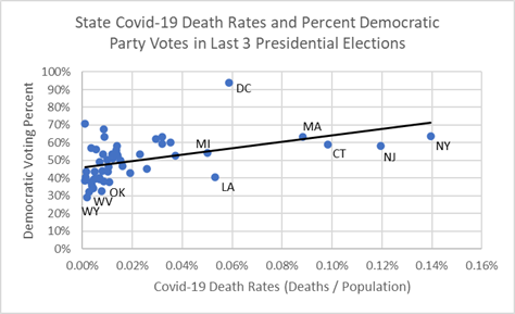
A brief political aside. One might suppose that the more covid-19 death rates grow the more states’ voters could push toward democratic majorities. In terms of the chart above, as states move to the right and experience higher covid-19 death rates they may also move up the chart’s black trend line toward higher democratic voting in the next election. On the other hand, majority republican voting states may stand to repeat past election wins and make gains because they can more aggressively open up their economies, create jobs, goods and services, while being supported by the robust public health and community health services that have helped keep the virus at bay.
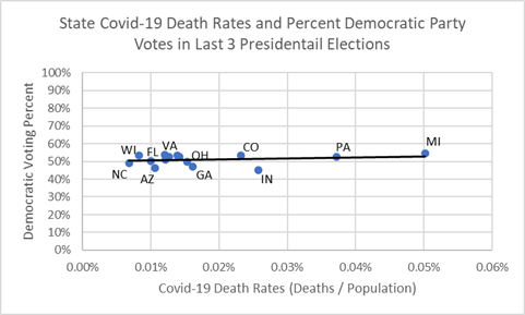
In election politics, “swing” states are of particular interest since most presidential elections are decided by how voters in these states vote. They are swing states because voting in these fifteen states is between 45% and 55% for the republican and democratic candidates. Will a health risk become a political risk? As illustrated in the chart below, the “covid effect” could move Pennsylvania and Michigan toward more democratic majorities because covid-19 death rates are well above the national average (0.03%). On the other hand, swing states in the last three presidential elections, such as Wisconsin and Florida, will likely enjoy the benefits of economic re-opening early and the re-employment it brings because they have low covid-19 death rates. This ambiguity is reflected in the “flat” trend line below between party voting percent and covid-19 death rates, re-fit here on just the 15 swing states. The data barely whispers about which way the 2020 political winds will blow.
“Swing” States Percent Democratic Voting in the Last Three Presidential Elections and Covid-19 Death Rates
The best public health policy would seem to be to invest in the public health and health care services of the states and Counties suffering debilitating loss due to the covid-19 health crisis. Prosperity is more complex than just one state’s ability to consume. It must also be able to employ. The covid-19 crisis has proven that without a healthy and safe workforce America cannot sustain a successful consumer society. Perhaps US economists can measure markets and US shareholders can measure corporate value differently. The crisis has shown they must account for not just the goods and services the markets and corporations create but for the value they contribute to a sustainable and healthy work community. Perhaps, today’s economic outlook would then be, per Dr. Justin Wolfers of the University of Michigan, Ford School of Public Policy, “an adjustment caused by a pandemic” requiring an extraordinarily heavy investment in the health and employment infrastructure of our national economy.
Strong party voting patterns of past presidential elections does indicate Counties that require more or less public health funding in the present. They need funding for community investments in parks, nutrition services, hospitals, health clinics, nursing homes, and, importantly, covid-19 testing and contact tracing to stop the spread of the virus. All Counties must prosper if the US is to prosper. America must get healthy again — it was obviously in ill health before the virus struck. Communities most at health risk need access to resources that will permit them to take ownership of and create a future in which their residents can live long and prosper.
Analysis of Covid-19 Deaths
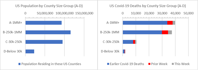
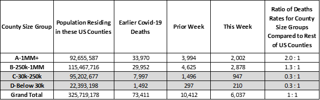
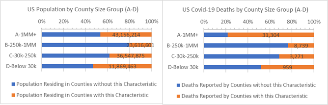
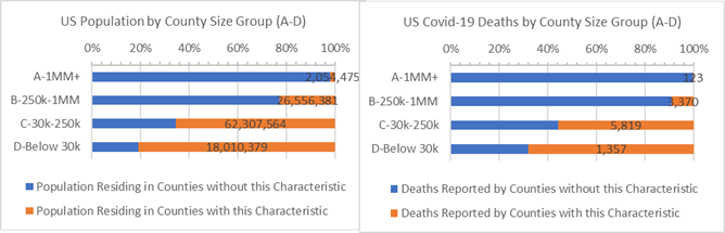
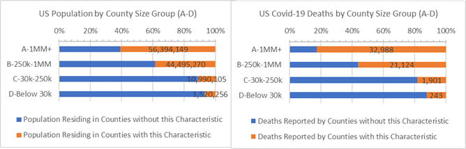
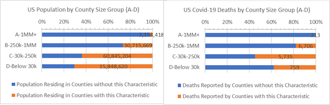
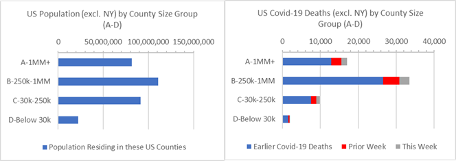
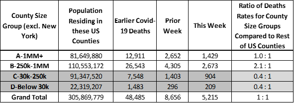
The pandemic has fallen heavily on 6 NY state counties. This especially affects the results of the group of 44 large US metropolitan “A” Counties with 1 million residents or more. They account for 28% of the US population and 44% of covid-19 deaths — the covid-19 death rate for “A” Counties is 2 times larger than that of the rest of the county. This imbalance is due to New York state. Without New York state included, the rate of covid-19 deaths is the same for “A” Counties as it is for the rest of US Counties (see end of this Analysis for details).
A death rate imbalance is also apparent for “B” Counties — Counties with between 250,000 to 1 million residents — which have 30% higher death rates than the rest of US Counties. Nearly half of the covid-19 deaths reported this week were from “B” Counties as shown the table below (grey bar).
US Population and Covid-19 Deaths by County Size Group
To better understand the imbalances in covid-19 death rates, this analysis considers major party voter percentages over the past 3 presidential elections, specifically, total votes cast during the 2008, 2012, and 2016 presidential elections for democratic and republican candidates. Each US County is assessed for stable loyalty to either party, and also for solid republican and democratic voting majorities. While voting patterns may not at first “make sense” as a health risk factor, if they are associated with underlying disease and social health risk factors then strong party voting majorities can indeed help understand public health and, as such, serve as health risk factors.
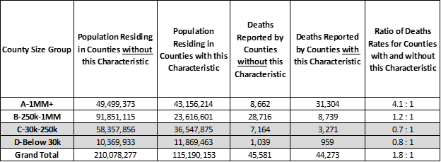
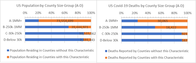
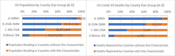
The graph below shows US Counties split into two groups with the results for strong majority party voting Counties highlighted (orange). Strongly partisan Counties have 80% higher deaths per 10,000 residents than the remaining US Counties — a 1.8 : 1 death rate ratio (see Analysis Approach section for more on the ratio measure). The smaller, rural “C” and “D” Counties that are more partisan have below average covid-19 death rates. This suggests that “C” and “D” Counties which do not vote strongly for one party or the other are experiencing high covid-19 death rates. (Will they determine the next election outcome?) Based on this overview, if we’re recommending public heath investment, then resources should be directed to the largest “A” and “B” Counties that have strongly partisan voting majorities (top two orange bars), but also to 69 million residents of smaller “C” and “D” Counties that are not strongly partisan voting communities (bottom two blue bars).
Population and Covid-19 Deaths for Counties where 65% or more of voters chose one of the two major parties (orange)
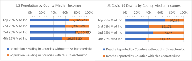
County median income bands shown in the table below each represent roughly 80 million US residents. They rank US Counties from high-to-low median income. The highest have median income above $73,000 while the lowest have median income below $38,000. The lowest median income Counties are often smaller, but they include some mid-sized “B” Counties.
Counties with highly loyal voters living in the 3rd and 4th median income bands have 4.1 and 2.2 times more covid-19 deaths per 10,000 residents than other low income Counties. The highest median income Counties with strong voting majorities have lower death rates than average and have been relatively healthy during the covid-19 crisis.
Population and Covid-19 Deaths for Counties where 65% or more of voters chose one of the two major parties (orange) — ranked by County Median Income band
Separate covid-19 outcomes for strong majority republican and democratic voting Counties follows. From a “useful data” perspective, past voting trends can be considered County health risk factors.
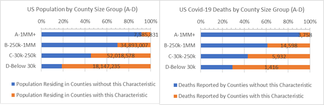
Strong majority republican voting in the past 3 presidential elections keeps Counties safe from covid-19 risk (orange bars). For every 10,000 residents 70% fewer residents die than in the rest of the US. Public health and health services in these Counties are functioning well. It is worth noting that small, rural “C” and “D” Counties account for most of the strong majority republican voting population. They also have relatively more deaths for every 10,000 residents than the large “A” and “B” Counties. If opening up causes additional covid-19 infections then death rates in these “C” and “D” Counties may get closer to the national average.
Population and Covid-19 Deaths for Counties where Major Party Votes were over 54.1% Republican (orange)
For strong majority republican voting Counties the rate of covid-19 deaths is consistent across all median income bands. From high-to-low median income strong republican voting Counties have 60% to 80% fewer deaths for every 10,000 residents than other US Counties.
Population and Covid-19 Deaths for Counties where Major Party Votes were over 54.1% Republican (orange) — ranked by County Median Income band
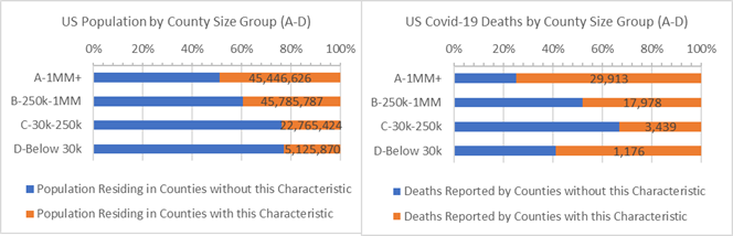
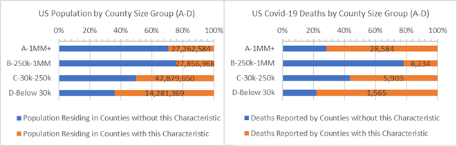
Strong majority democratic voters in the past 3 presidential elections reside mainly in large “A” and “B” Counties. Strong majority democratic voting Counties have over 3.1 times more covid-19 deaths per 10,000 residents than other Counties. They account for 35% of the US population but 63% of covid-19 deaths. It is the mirror image opposite of what is happening in the small, rural strong majority republican voting Counties. (Even when New York state is excluded covid-19 deaths per 10,000 residents of strong majority democratic voting Counties is 2.6 times larger than other Counties.)
Population and Covid-19 Deaths for Counties where Major Party Votes were over 58% Democratic (orange)
Across all median income bands strong majority democratic voting Counties have high covid-19 health risks. This is particularly true for the lowest two income bands where residents of strong majority democratic voting Counties have 5 times more covid-19 deaths per 10,000 residents than other low income Counties. The high death rate, 0.048%, mean that 5 out of 10,000 residents have died in the past two months because of covid-19 infections.
Population and Covid-19 Deaths for Counties where Major Party Votes were over 58% Democratic (orange) — ranked by Median Income band
The data suggest that primarily large “A” and “B” Counties with strong majority democratic voting, particularly those with low median incomes, require more investment in public health and health care services if in the future we wish to lower the health risks in these communities — and “chase covid-19 back to the wild” where it came from, as Dr. Ali Khan of the University of Nebraska, School of Public Health, might say.
Analysis Approach
This is one of a series of analyses that relate covid-19 deaths to key County health and demographic characteristics, including risk factors such as cancer death rates or percent of adults over 60. Each analysis focuses on the Counties’ risk factors that are higher than some “average”. The “average” is defined here as the characteristic’s incidence or percentage — for example, average cancer death rate or percentage of adults over 60 — and this risk group of Counties accounts for roughly 1/3rd of the US population when pooled together. Covid-19 deaths are then totaled for Counties with and without the risk factor.
Side-by-side bar charts illustrate how Counties are faring in the covid-19 crises when grouped by size of population and median income and split by above and below some average for a risk factor.
Covid-19 death rates for resulting 1/3 versus 2/3 population comparisons are then written as a ratio, such as, 0.5 : 1. Of course, the death rate ratios change as the data changes. For example, a 0.8 : 1 ratio compares the covid-19 death rates for Counties with and without the above average percent adults over age 60 risk factor. All things being equal, a 1.0 : 1 ratio means the covid-19 death rates match the ratio of the County populations. Typically it does not.
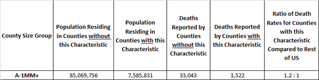
Here’s an example. The rate of covid-19 deaths is deaths divided by population. It’s 0.03% today, meaning 3 out of 10,000 US residents have died due to covid-19. In these studies we compare death rates for groups of Counties with and without the risk factors in a covid-19 death rate ratio. It is an “odds” ratio of death occurring with and without the risk factor. The 1.2 : 1 ratio below is a comparison of the death rates between “A” Counties with and without above adult age 60 risk factor. The ratio of the death rates is 1.2 = (3,522 /7,585,831) / (33,043/ 85,069,756). It tells us that the odds of dying from covid-19 are 20% higher for populations in large “A” Counties with above average adult age 60 populations.
Example: “A” Counties where Adult Age 60+ is 23% or more of County Population
Update on Past Analyses
Above Average White American, Hispanic American and African American Counties.
Counties with above average White American populations (85% or more White American) have 70% fewer deaths per 10,000 residents than all remaining US Counties (0.3 : 1 ratio).
Counties where White Americans are 85% or more of the population (orange)
Counties with above average Hispanic American populations (18% or more Hispanic American) have 90% more deaths per 10,000 residents than other Counties to have covid-19 deaths (1.9 : 1 ratio).
Counties where Hispanic Americans are 18% or more of the population (orange)
Counties with above average African American populations (13% or more African American) have 140% more deaths per 10,000 residents than other US Counties (2.4 : 1 ratio).
Counties where African Americans are 13% or more of the population (orange)
Age 60+. 35% of the US population live in older Counties defined as above average Age 60+ populations (orange bars on the left graph). Since 8 of 10 covid-19 deaths are adults 65 years and older Counties with above average Age 60+ populations, especially “C” and “D” Counties, are vulnerable in the covid-19 crisis (and other health risks, as well).
Counties where Adult Age 60+ is (orange) or is not (blue) 23% or more of population by County Size
Heart Disease. It may seem like heart disease is a “city problem”, but it is mainly because most covid-19 deaths are found in counties with above average heart disease deaths. But, large populations in rural “C” and “D” Counties also have the heart disease risk factor and above average covid-19 death rates, as well.
Counties where Heart Disease causes 0.2% or more population deaths (orange) or not (blue)
Cancer. Above average Cancer death Counties (orange bars in the charts) account for 38% of the US population and 30% of covid-19 deaths. When New York state is removed, Counties with the Cancer risk factor have 10% higher covid-19 death rates than the remaining US Counties.
Counties where Cancer causes 0.19% or more population deaths (orange) or not (blue) by County Size
More on County Groups, more on the US Excluding NY
3,142 US Counties are geographic and administrative districts for which many convenient statistics are gathered, including covid-19 deaths. Each County can be characterized as urban and rural and they range in population from 10.2 million (LA County, CA) down to 88 (Kalawao County, HI) residents. In these reports, comparisons are made between four groups of counties depending on population size and by median income bands, as indicated in the chart axes.
New York state accounts for 6% of the US population and disproportionately more covid-19 deaths. At time it is useful to consider total US results excluding New York state. The chart below shows a disproportionate majority of covid-19 deaths occurring suburban “B” Counties when New York State is excluded (second bar on right graph). Nationwide covid-19 death rates are 0.02% when New York state is excluded, compared to 0.03% overall.
US Population and Covid-19 Deaths by County Size Group — Excluding NY State
Acknowledgment
This US County health analysis is dedicated to individuals who are the victims of the Covid-19 virus and to all the people working hard to keep our US Counties safe and nourished.
Counties employ 3.6 million American in the fight against covid-19, including medical care, emergency response and public safety jobs but some are laying off staff due to tax revenue shortfalls because of the crisis, per the National Association of Counties.
What Next?
In future reports we’ll continue to examine county health statistics that might help put covid-19 statistics in helpful light.
Some other measures that may tell the developing covid-19 story:
· How do Covid-19 deaths change when adjusted for the first date one was reported?
· Do Counties’ previous flu or respiratory deaths tell us about County covid-19 death rates?
· Do County median income or education tell us about the likelihood of covid-19 deaths?
· Do results change if we use the exact density of County population instead of County Size?
· Do average temperatures or levels of particulate matters matter?
If you have any questions about this analysis or the data, or if you have suggestions, please don’t hesitate to contact me.
-Pete
Sources: US Census, USA Facts Covid-19, IHME forecasts, US Cancer Deaths NIH 5 year average, CDC Handbook on Death Reporting, 2003; New York Times; Median Income; CDC Wonder Detailed Mortality; CDC Fine Particulate Matter 2003–2011; MIT Election Data + Science Lab